|
A table is a perfect format for some types of data, including statistical information. CKEditor not only lets you add and edit this document element in a quick and easy way but also offers advanced customization options.
Creating a Table
To create a table in CKEditor, press the  button on the toolbar. The Table Properties dialog window that will open lets you set configuration options that define table size, its display properties, or other advanced properties. button on the toolbar. The Table Properties dialog window that will open lets you set configuration options that define table size, its display properties, or other advanced properties.
The Table Properties dialog window includes two tabs that group table options:
Table Properties
The Table Properties tab is the default tab that opens after you press the button on the toolbar. It allows you to set the table dimensions and configure the way it will appear in the document.
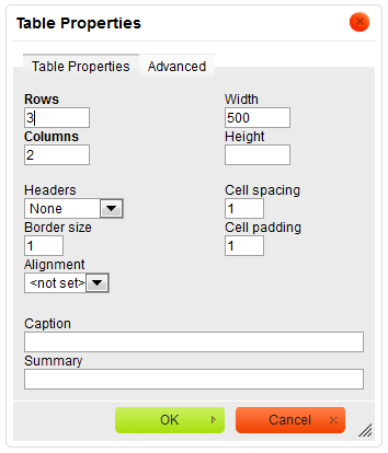
Table Properties dialog window with the default tab open
Below is an overview of all Table Properties tab elements:
-
Rows – the number of rows in the table (obligatory).
-
Columns – the number of columns in the table (obligatory).
-
Width – the width of the table in pixels or a percent value. Giving the width as a percent value lets you set the proportion of the editing area that the table will occupy.
-
Height – the height of the table in pixels.
-
Headers – the drop-down list that formats certain table cells as headers, which applies special formatting to them. You can apply header formatting to First Row, First Column or Both.
-
Border size – the thickness of the table border in pixels.
-
Alignment – the alignment of the table on the page. The following options are available: Left, Center, Right.
-
Cell spacing – the space between individual cells as well as cells and table borders, in pixels.
-
Cell padding – the space between the cell border and its contents, in pixels.
-
Caption – the label of the table that is displayed on top of it.
-
Summary – the summary of the table contents that is available for assistive devices like screen readers. It is a good practice to provide your tables with meaningful summary text in order to make it more accessible to users with disabilities.
Advanced
The Advanced tab lets you configure additional image options such as assign it an ID, a class, a language direction, or CSS style properties. It is meant for advanced users with knowledge of HTML as well as CSS, and gives nearly endless possibilities as far as the presentation of the table is concerned.
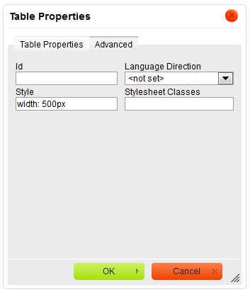
Advanced tab of the Table Properties window
Below is an overview of all Advanced tab elements:
-
Id – a unique identifier for a table element in the document (
id attribute).
-
Language Direction – the direction of the text in the table: left to right (LTR) or right to left (RTL) (
dir attribute).
-
Stylesheet Classes – the class of the table element (
class attribute). Note that a table element might be assigned more than one class. If this is a case, separate class names with spaces.
-
Style – CSS style definitions (
style attribute). Note that each value must end with a semi-colon and individual properties should be separated with spaces.
Working With Tables
Once inserted into the document, the table can be modified. To edit the table, either double-click it, or open the table context menu by clicking it with the right mouse button or using the Menu/Applicationkey on your keyboard.
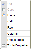
The context menu for a table element
To delete the whole table and its contents, use the Delete Table option.
When you choose the Table Properties option, the dialog window of the same name will appear. It allows you to change the configuration options that were set when the table was created, except the number of rows and columns which are grayed out.
Additionally the table context menu lets you modify the rows, columns or particular table cells. This method makes it possible to insert new rows, columns or cells in specified locations as well as merge and split cells.
Editing Table Rows
The table context menu lets you edit table rows. If you hover your mouse over the Row menu option, further options become available.
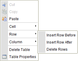
The context menu for a table row element
Below is an overview of all Row context menu option elements:
-
Insert Row Before – inserts a new row before the one that contains the cursor.
-
Insert Row After – inserts a new row after the one that contains the cursor.
-
Delete Rows – deletes a row that contains the cursor.
Note that CKEditor makes it possible to select multiple table cells by dragging the mouse over them, so an operation like deletion may be applied to many table rows at once.
Editing Table Columns
The table context menu lets you edit table columns. If you hover your mouse over the Column menu option, further options become available.
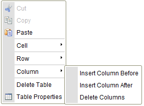
The context menu for a table column element
Below is an overview of all Column context menu option elements:
-
Insert Column Before – inserts a new column before the one that contains the cursor.
-
Insert Column After – inserts a new column after the one that contains the cursor.
-
Delete Columns – deletes a column that contains the cursor.
Note that CKEditor makes it possible to select multiple table cells by dragging the mouse over them, so an operation like deletion may be applied to many table columns at once.
Editing Table Cells
The table context menu lets you edit table cells. If you hover your mouse over the Cell menu option, further options become available.
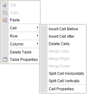
The context menu for a table cell element
Below is an overview of all Cell context menu option elements:
-
Insert Cell Before – inserts a new cell before the one that contains the cursor.
-
Insert Cell After – inserts a new cell after the one that contains the cursor.
-
Delete Cells – deletes a cell that contains the cursor.
-
Merge Cells – merges multiple cells in one. This option is only available if two or more cells are selected.
-
Merge Right – merges the selected cell with a cell on its right. The content of both cells becomes joined. This option is only available if no more than one cell is selected.
-
Merge Down – merges the selected cell with a cell located on its bottom. The content of both cells becomes joined. This option is only available if no more than one cell is selected.
-
Split Cell Horizontally – splits the selected cell in two, creating a new cell on its right. The content of the cell appears in the original, left cell. This option is only available if no more than one cell is selected.
-
Split Cell Vertically – splits the selected cell in two, creating a new cell on its bottom. The content of the cell appears in the original, upper cell. This option is only available if no more than one cell is selected.
-
Cell Properties – opens the Cell Properties dialog window that lets you configure cell size, type, color, and content alignment.
Note that CKEditor makes it possible to select multiple table cells by dragging the mouse over them, so an operation like deletion or merging may be applied to many table rows at once.
Cell Properties
Table cells in CKEditor can be further customized, creating a unique look and feel. Various configuration options can be set in the Cell Properties dialog window that is opened from the table cell context menu.
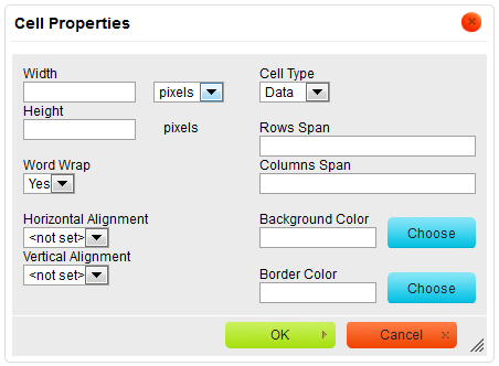
The Cell Properties dialog window in CKEditor
Below is an overview of all Cell Properties dialog window elements:
-
Width – the width of the cell in pixels or a percent value. Giving the width as a percent value lets you set the proportion of the row that the cell (and the column it is located in) will occupy.
-
Height – the height of the cell in pixels.
-
Cell Type – the type of the table cell — either a normal data cell or a header cell with special formatting.
-
Word Wrap – this setting turns word wrapping of the cell content on and off.
-
Rows Span – this setting stretches the cell downward over several rows. Entering a numeric value sets the
rowspan attribute.
-
Columns Span – this setting stretches the cell to the right over several columns. Entering a numeric value sets the
colspan attribute.
-
Horizontal Alignment – the horizontal alignment of table cell contents. The following options are available: Left, Center, Right.
-
Vertical Alignment – the vertical alignment of table cell contents. The following options are available: Top, Middle, Bottom or Baseline.
-
Background Color – the color of the cell background. You can use either of the following methods to set the color:
-
Enter the RGB value in the text box, in the
rgb(nn, nn, nn) format, where nn is a numeric value on a scale from 0 to 255 representing the red, green, and blue channel.
-
Enter the hexadecimal RGB value in the text box, in the
#nnnnnn format, where the n letters stand for the three pairs of hex color values representing the red, green, and blue channel.
-
Use the Choose button to open the Select color dialog window and pick the color with your mouse.
-
Border Color – the color of the cell border. You can use either of the following methods to set the color:
-
Enter the RGB value in the text box, in the
rgb(nn, nn, nn) format, where nn is a numeric value on a scale from 0 to 255 representing the red, green, and blue channel.
-
Enter the hexadecimal RGB value in the text box, in the
#nnnnnn format, where the n letters stand for the three pairs of hex color values representing the red, green, and blue channel.
-
Use the Choose button to open the Select color dialog window and pick the color with your mouse.
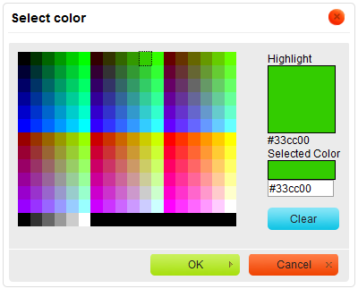
The Select Color dialog window in CKEditor used for setting the cell background and border color
|


.png)