Checkbox
A checkbox is a form element that lets you select an item and send your selection to the server when you are submitting the form. Multiple checkboxes may be combined in a logical group, although their selection is independent of one another, which means that more than one item of the group can be selected at a time.
To insert a checkbox into a document in CKEditor, place the cursor inside the form element and press the  toolbar button. The Checkbox Properties dialog window that will open lets you set the name and value of a checkbox as well as decide whether it should be selected by default. toolbar button. The Checkbox Properties dialog window that will open lets you set the name and value of a checkbox as well as decide whether it should be selected by default.
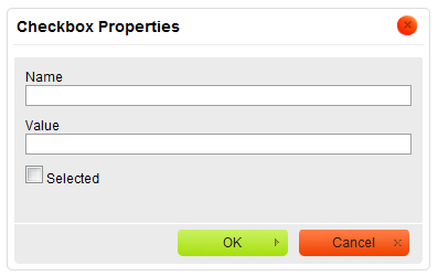
Checkbox Properties dialog window in CKEditor
Below is an overview of all Checkbox Properties dialog window elements:
-
Name – the name of the checkbox element (
name attribute).
-
Value – the value of the checkbox element (
value attribute).
-
Selected – the parameter that specifies the default state of the checkbox — whether it is selected or not (
checked attribute).
Once you configure the checkbox and click the OK button, the checkbox will be visible in editing area and you will be able to add some text that describes the checkbox option.
Radio Button
A radio button is a form element that lets you select one item from the list and send your selection to the server when you are submitting the form. Radio buttons are usually used in groups and they differ from another form element, the checkbox, in that only one item can be selected at a time.
To insert a radio button into a document in CKEditor, place the cursor inside the form element and press the  toolbar button. The Radio Button Properties dialog window that will open lets you set the name and value of a radio button as well as decide whether it should be selected by default. toolbar button. The Radio Button Properties dialog window that will open lets you set the name and value of a radio button as well as decide whether it should be selected by default.
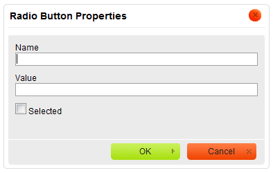
Radio Button Properties dialog window in CKEditor
Below is an overview of all Radio Button Properties dialog window elements:
-
Name – the name of the radio button element (
name attribute).
-
Value – the value of the radio button element (
value attribute).
-
Selected – the parameter that specifies the default state of the radio button — whether it is selected or not (
checked attribute).
Once you configure the radio button and click the OK button, the radio button will be visible in the editing area and you will be able to add some text that describes the radio button option.
Text Field
A text field is a form element that lets you enter text into a single-line field and send your input to the server when you are submitting the form. Text fields differ from another form element, the textarea, in that they are single-line fields and thus are meant for shorter entries.
A text field element comes in two variants. The first one lets you enter the text and see it as you type. The second one is used for entering passwords and obscures the typed characters with an asterisk (*), a bullet (•), or another symbol used by the browser.
To insert a text field into a document in CKEditor, place the cursor inside the form element and press the  toolbar button. The Text Field Properties dialog window that will open lets you set the name, value, type, and size of a text field. toolbar button. The Text Field Properties dialog window that will open lets you set the name, value, type, and size of a text field.
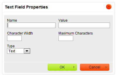
Text Field Properties dialog window in CKEditor
Below is an overview of all Text Field Properties dialog window elements:
-
Name – the name of the text field element (
name attribute).
-
Value – the value of the text field element (
value attribute). This text will be visible in the text field when the form is loaded in the browser.
-
Character Width – the width of the text field specified as the number of characters that will fit in the field (
size attribute). If omitted, the text field will have a default size determined by the browser.
-
Maximum Characters – the limit of characters that may be entered into the text field (
maxlength attribute). If omitted, the length of text that you enter into the field will be unlimited and once you exceed the size of the box, the text will scroll to the right.
-
Type – the parameter that specifies whether the form field will be used for plain text (
type="text" attribute) or passwords (type="password" attribute).
Once you configure the text field and click the OK button, the text field will be visible in the editing area with the default value shown either as plain text, or a series of asterisks/bullets.
The figure above shows two text fields added to a form. The first one is a Text type with character width set to 60 and the second one is a Password type with a default character width set by the browser.
Textarea
A textarea is a form element that lets you enter text into a multiline, scrollable field, and send your input to the server when you are submitting the form. Textareas differ from another form element, the text field, in that they are multiline fields and thus are meant for longer entries.
To insert a textarea into a document in CKEditor, place the cursor inside the form element and press the  toolbar button. The Textarea Properties dialog window that will open lets you set the name and size of a textarea. toolbar button. The Textarea Properties dialog window that will open lets you set the name and size of a textarea.
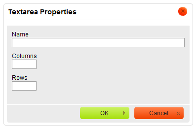
Textarea Properties dialog window in CKEditor
Below is an overview of all Textarea Properties dialog window elements:
-
Name – the name of the textarea element (
name attribute).
-
Columns – the width of the textarea specified as the number of characters in the line (
cols attribute). If omitted, the textarea will have a default width determined by the browser.
-
Rows – the number of lines of text that will be displayed in the textarea (
rows attribute). If omitted, the textarea will have a default height determined by the browser.
Once you configure the textarea and click the OK button, the textarea will be visible in the editing area as an empty rectangle.
Since the textarea element does not accept a default message that would be shown in the field, it is presented as an empty rectangle. Depending on a browser, a vertical scrollbar might also be visible, and it might be possible to resize the textarea by clicking its frame and dragging with a mouse.
Selection Field
A selection field is a form element that lets you select one or more items from the scrollable list and send your selection to the server when you are submitting the form. Selection fields usually contain numerous options and depending on the settings, you can either limit the selection to one item or choose multiple items, by holding the Ctrl key while selecting them with a mouse or an Arrow key on your keyboard.
To insert a selection field into a document in CKEditor, place the cursor inside the form element and press the  toolbar button. The Selection Field Properties dialog window that will open lets you set the name of a selection field as well as the number and content of available options. toolbar button. The Selection Field Properties dialog window that will open lets you set the name of a selection field as well as the number and content of available options.
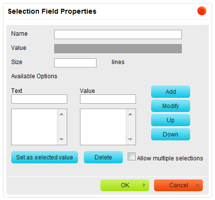
Selection Field Properties dialog window in CKEditor
Below is an overview of all Selection Field Properties dialog window elements:
-
Name – the name of the selection field element (
name attribute).
-
Value – the value of the selection field element (
value attribute). This option is filled in automatically when you set one of the items as a selected value.
-
Size – the number of rows of the selection field that are visible by default (
size attribute). If the selection field contains more items, a scrollbar will appear.
-
Available Options – this section contains the options that the user will be able to choose from the selection field.
-
Text – the label of the selection field option.
-
Value – the value of the selection field option submitted to the server.
-
Add – adds an option to the selection field.
-
Modify – modifies a selected option.
-
Up – moves an option one row up the selection field.
-
Down – moves an option one row down the selection field.
-
Set as selected value – sets an option as selected by default.
-
Delete – deletes a selected option.
-
Allow multiple selections – lets the user select more than one option from the selection field.
Once you configure the selection field and click the OK button, the selection field will be visible in the editing area.
Button
A button is a form element that gives the user a visual cue for completing a form action.
Form button element comes in three variants. The first one is a standard button with arbitrary text. The second one is a submit button that submits the form data to the server. The third one is a reset button that resets the form elements to their default values.
To insert a button into a document in CKEditor, place the cursor inside the form element and press the  toolbar button. The Button Properties dialog window that will open lets you set the name, value, and type of the button element. toolbar button. The Button Properties dialog window that will open lets you set the name, value, and type of the button element.
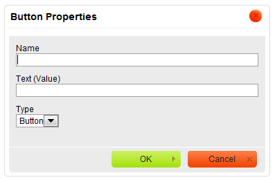
Button Properties dialog window in CKEditor
Below is an overview of all Button Properties dialog window elements:
-
Name – the name of the button element (
name attribute).
-
Text (Value) – the text displayed on the button (
value attribute).
-
Type – the button type. Possible options are Button (standard button with arbitrary text;
type="button" attribute), Submit (a button that submits the form data to the server; type="submit" attribute), and Reset (a button resetting the form fields to their default values; type="reset" attribute.
Once you configure the button element and click OK, the button will be visible in the editing area with the text specified in the Text (Value) field.
The figure above shows three buttons added to a form. The first one is a Button type with an arbitrary text, the second one is a Submit type submitting the form to the server, and the third one is a Reset type resetting the form input fields to their initial values.
Image Button
An image button is a form element that gives the user a visual cue for completing a form action. It is a clickable image that functions just like a standard button but has a customized appearance.
To insert an image button into a document in CKEditor, place the cursor inside the form element and press the  toolbar button. The Image Button Properties dialog window that will open lets you configure the URL and display options of the custom image button. toolbar button. The Image Button Properties dialog window that will open lets you configure the URL and display options of the custom image button.
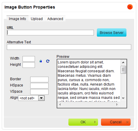
Image Button Properties dialog window in CKEditor
The Image Button Properties dialog window includes three tabs that group image button options: Image Info, Upload, and Advanced.
Once you configure the image button element and click OK, the image button will be visible in the editing area.
Hidden Field
A hidden field is a special form element in that it does not allow any interaction with the user and is hidden from view. At the same time its value is sent to the server when the form is being submitted.
To insert a hidden field into a document in CKEditor, place the cursor inside the form element and press the  toolbar button. The Hidden Field Properties dialog window that will open lets you set the name and value of a hidden field. toolbar button. The Hidden Field Properties dialog window that will open lets you set the name and value of a hidden field.
Hidden Field Properties dialog window in CKEditor
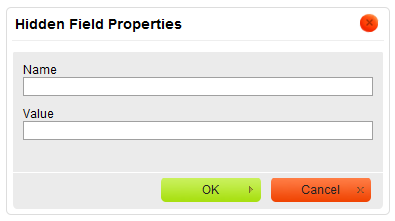
Below is an overview of all Hidden Field Properties dialog window elements:
-
Name – the name of the hidden field element (
name attribute).
-
Value – the value of the hidden field element (
value attribute).
Once you configure the hidden field and click the OK button, the hidden field will be visible in the editing area as a small icon. Note, however, that as the name suggests, it will be hidden while in preview mode.
|


.png)